January 5, 2026
A colour we have never seen

on
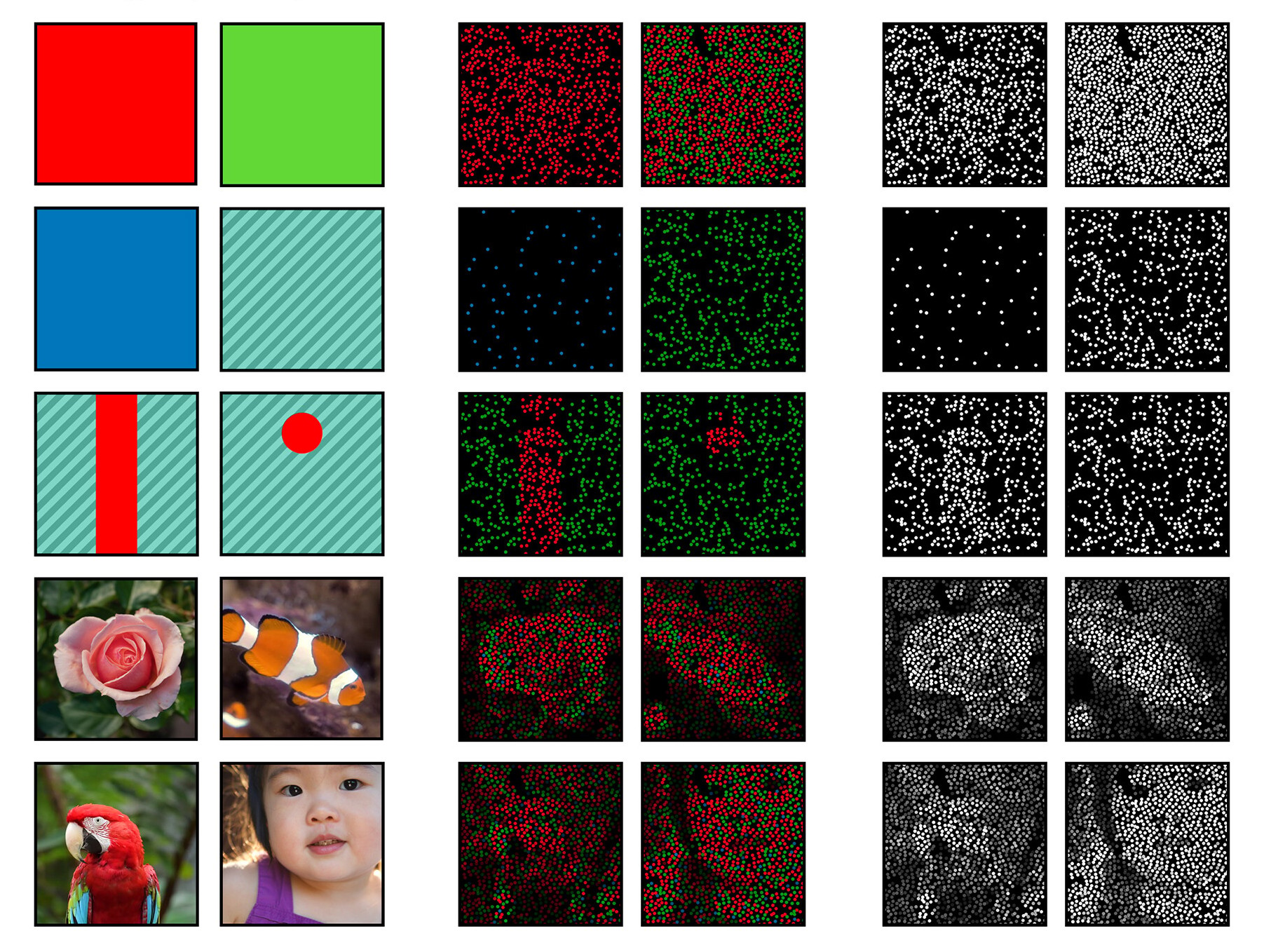
↑ Reconstructing perception: from simple colour blocks to complex scenes, targeted cone activation produces images — including “olo,” a colour created by stimulating only M-cones. Image credit: Fong, J. et al, Science Advances (2025).
From “Olo” to RGB and LSD: a guide to colour gamut
In April 2025, headlines rippled through both the scientific world and design communities when researchers claimed to have experienced a colour no human has ever seen before. Using an experimental device nicknamed the Oz Vision System, scientists in California fired precisely controlled laser pulses into the eyes of five volunteers, stimulating individual retina cone cells in ways impossible in nature. The result was a hue the participants described as an intensely saturated blue-green — a colour dubbed “olo” — allegedly outside the gamut of ordinary human experience. But this bold claim is contested: some vision scientists argue it’s better framed as an extreme saturation of a normally perceivable colour rather than a wholly new one. Still, the experiment underscores how our experience of colour is bounded by biology.
Seeing more (or less) than humans: the colourful world of animal vision
Humans are trichromats: our colour vision depends on three types of cone cells — sensitive to long (red), medium (green), and short (blue) wavelengths. This biological setup lets us distinguish millions of hues within the visible spectrum. But in nature, this isn’t the only model.
→ Dogs — and most mammals — are dichromats, possessing only two types of cone cells (often sensitive to blue and green). This means they cannot distinguish certain colours humans can, especially reds and oranges.
→ Bees and some butterflies are trichromats with one receptor tuned to ultraviolet light, opening a part of the spectrum completely invisible to humans. Flowers often exploit this by displaying ultraviolet nectar guides that attract pollinators.
→ Birds, fish, and reptiles frequently have tetrachromatic vision — four or more photoreceptor types — which means they can discriminate even more colours across the visible spectrum and into ultraviolet.
→ Mantis shrimps possess up to 12 photoreceptor types. But having many receptors doesn’t necessarily translate to better discrimination; research suggests mantis shrimps process colour differently, prioritising rapid detection over nuanced perception.
Seeing through other eyes: the camera experiment
One vivid, accessible exploration of animal colour perception in recent years is Netflix’s Life in Colour, where Sir David Attenborough presents a stunning exploration of how animals perceive and use colour for communication, camouflage, and survival. Using specialised camera technology, the series reveals ultraviolet patterns on butterfly wings, polarised signals in mantis shrimp, and other visual cues invisible to humans.
A similar experiment was developed by researchers Vera Vasas, Daniel Hanley and others, which created a camera system that records across a broader range of wavelengths, including ultraviolet, and translates the data into approximations of animal vision. This allows us to “see” through the eyes of bees, birds, and mammals, exposing environments that look radically different from our human perspective.
If you are feeling tech-savvy, you can build the system using the open source code and plans made available by the researchers.
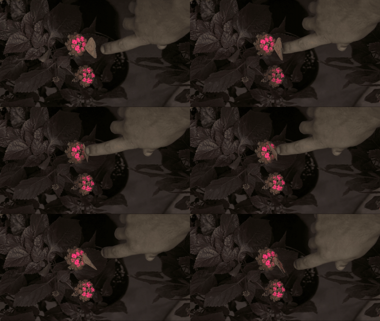
↑ False-colour footage reveals butterflies’ angle-dependent UV iridescence — a reminder that some of nature’s most expressive colours exist entirely outside human vision. Image credit: Vasas et al. (2024) PLOS Biology.
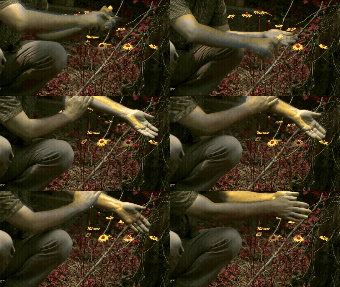
↑ In honeybee vision, UV-blocking sunscreen shifts from white to yellow, exposing how materials that seem neutral to us can dramatically alter colour signals for other species. Image credit: Vasas et al. (2024) PLOS Biology.
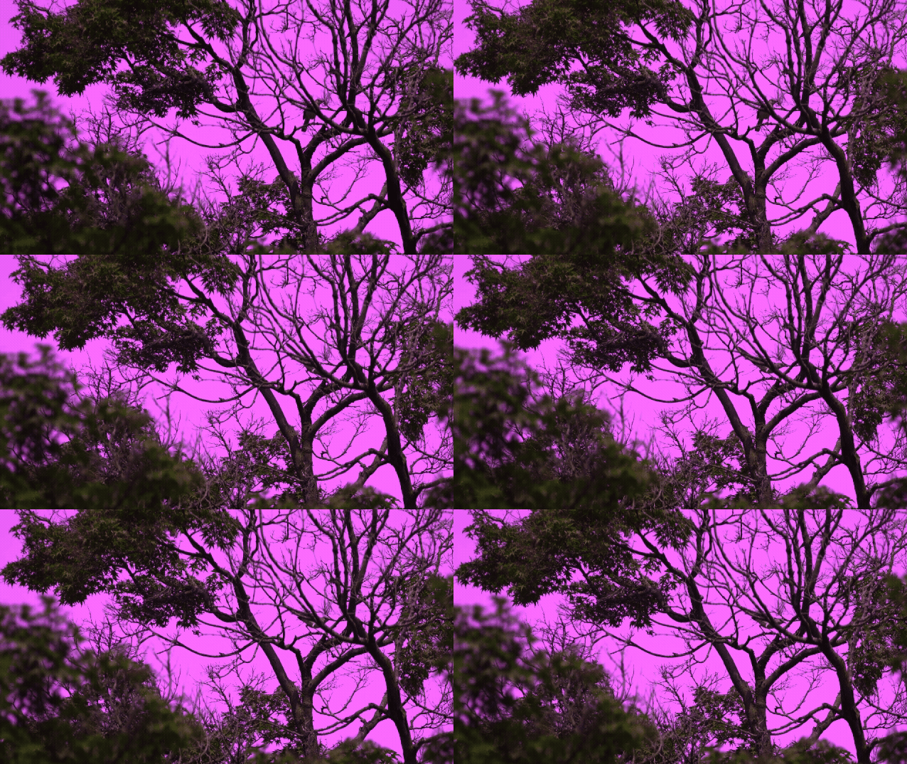
↑ Rendered in avian false colours, northern mockingbirds reveal UV-reflective plumage and a sky rich in ultraviolet — a world where “blue” is only part of the story. Image credit: Vasas et al. (2024) PLOS Biology.
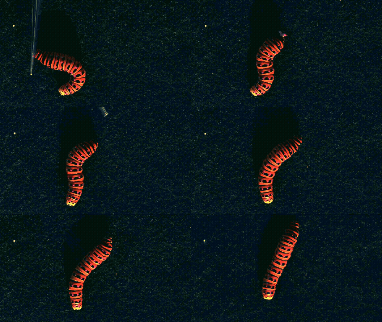
↑ Seen through honeybee vision, a swallowtail caterpillar’s defensive display transforms: UV-reflective yellow markings shift to magenta, turning colour into a high-contrast warning signal for predators that see beyond the human spectrum. Image credit: Vasas et al. (2024) PLOS Biology.
Colour gamut: RGB, CMYK, Pantone and the limits of reproduction
When designers talk about colour, they’re often really talking about colour gamuts — the range of colours that a device or process can reproduce.
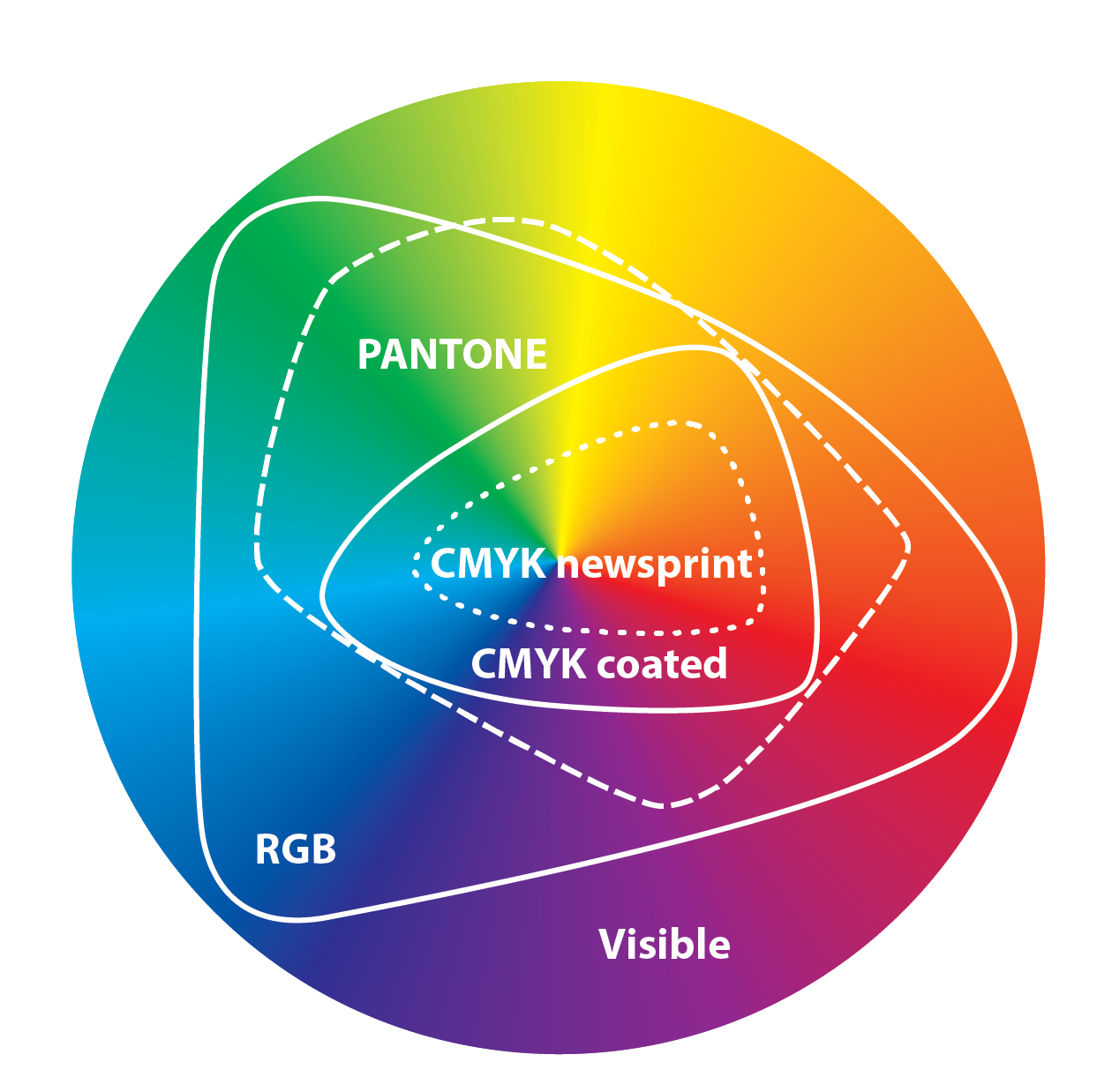
↑ Visible color space with approximate RGB, PANTONE®, CMYK coated, and newsprint gamuts. Image credit: Wade Dansby
RGB: the painter of light
RGB (Red-Green-Blue) is an additive colour space. Mixing red, green, and blue light in varying intensities produces a vast range of colours. Our screens — from phones to cinema displays — use RGB because light emitted directly can represent a wider gamut than many print processes.
Typical RGB spaces include:
→ Web-Safe Colour Palette — a relic of old displays designed to avoid dithering; largely obsolete but still referenced in some UI contexts.
→ sRGB — standard for web and most consumer displays.
→Adobe RGB — broader gamut, often used by photographers and high-end monitors.
→ ProPhoto RGB and other wide-gamut spaces — even larger, used in professional imaging workflows.Wider gamuts like Adobe RGB and ProPhoto preserve saturated greens and cyans better in print — but they must be converted carefully for web or smaller-gamut outputs.
These digital gamuts still don’t encompass all perceivable colours. For example, some printed neons won't look very vibrant on photos.
CMYK: print’s constrained spectrum
CMYK (Cyan-Magenta-Yellow-Key/Black) is a subtractive process used for printing. Unlike RGB’s emitted light, CMYK reproduces colour by absorbing certain wavelengths from reflected white light.
Because of ink properties and paper reflectivity, CMYK’s gamut is significantly smaller than RGB’s. That’s why brilliant RGB blues or greens you see on a screen often look dull or muted when printed with standard four-colour process: those hues simply lie outside CMYK’s reproducible space.
This is where print management becomes crucial. Print management is the practice of controlling and standardising colour across digital and physical outputs, ensuring what you see on your screen is as close as possible to what ends up on paper. It involves a combination of colour profiles, calibrated devices, and consistent workflows so that inks, papers, and presses interact predictably. Without it, even technically correct CMYK files can produce inconsistent or disappointing results across different print runs or materials.
To help achieve this, the printing industry relies on FOGRA standards, which provide detailed specifications for preparing files and calibrating presses. These standards define how colours should appear on specific substrates — for example:
→ FOGRA39 for coated paper (glossy or matte finishes)
→ FOGRA52 for uncoated paper (rougher textures like letterheads or stationery)
For colours that still lie outside CMYK’s gamut, designers often turn to Pantone or other spot colour systems.
Pantone & special inks: extending the gamut
The Pantone Matching System (PMS) uses pre-mixed solid colours (spot colours) to achieve hues that would be impossible in standard CMYK — especially vivid oranges, greens, or fluorescents.
Other special print options include:
→ Metallic and neon inks
→ Varnishes and coatings
→ White or opaque bases on coloured substrates
These techniques let printing flirt with colours beyond CMYK’s natural limits, much as the Oz system explored beyond the limits of natural human vision.

off
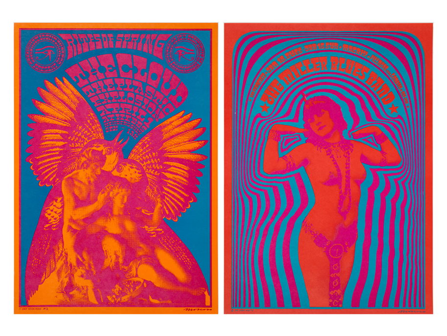
↑ Design by Victor Moscovo (1967). In the same way CMYK colours have trouble reproducing RGB ones, the same happens inversely. These poster colours in real life are much more vibrant than what is possible to capture in photography. Image credits: San Francisco Museum of Modern Art
LSD, Day‑Glo and the “Off” Gamut of Psychedelic Art
People who take LSD often report seeing more intense or unfamiliar colours — not because new wavelengths enter the eye, but because the brain’s usual filters loosen. The visual system still receives the same wavelengths of light, but processes them differently: colour constancy weakens, contrasts intensify, and subtle gradients become vividly charged. It’s not an expanded physical gamut, but an expanded perceptual one.
This helps explain the visual language of psychedelic art in the late 1960s and 70s. Posters, album covers, and light shows embraced vibrating palettes, clashing hues, and unstable figure–ground relationships that seemed to echo altered states of consciousness.
Silk‑screen printing combined with vivid Day‑Glo inks produced posters that appeared to pulse with energy. Michael English and Nigel Waymouth, working as Hapshash and the Coloured Coat, created iconic posters for the UFO Club that paired thick, luminous inks with fluid letterforms and metallic foil backgrounds — amplifying contrast and saturation in ways standard printing rarely achieved. Designers such as Martin Sharp, Dudley Edwards, and Michael McInnerney also experimented with rainbow inking, metallic papers, and spatial colour effects, creating compositions that felt dynamic and immersive.
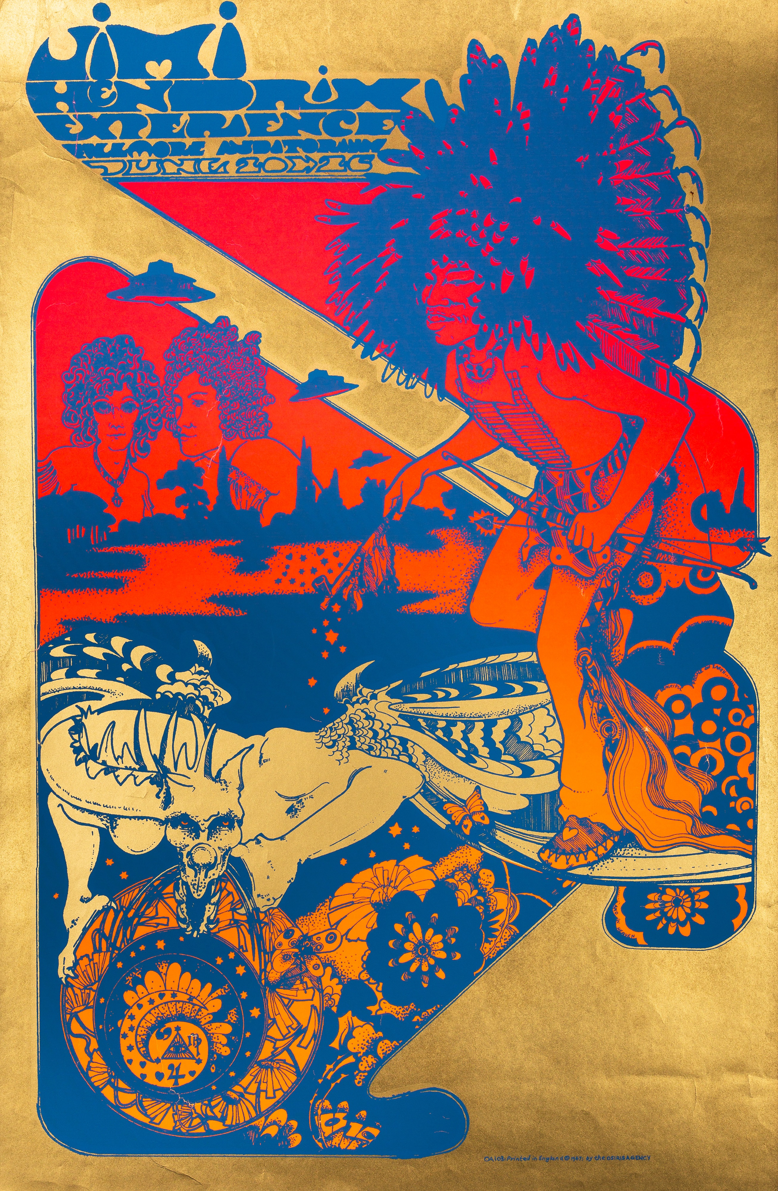
↑ Design by Hapshash and the Coloured Coat
Day‑Glo pigments themselves — originally developed for industrial and safety purposes — became a signature element of the aesthetic because of their intense fluorescence and high visibility in daylight and under UV light. From blazing oranges and hot pinks to signal greens, these colours leapt off the page, felt alive, and embodied sensory liberation.
words
Cleber de Campos is the co-founder of On Colour Off Colour. He is a Design Director at Nomad Studio. Prior to that, he was an Associate Partner at Pentagram London. His favourite colour is dark grey.
links
The Guardian — Hue new? Scientists claim to have found colour no one has seen before
The Conversation — Inside the Colourful World of Animal Vision
Synthetic Fluorescents: Day-Glo from Novelty to Norm
Psychedelic Graphic Design: A Guide to the Mind-Bending Art of the 1960s
Eye Magazine — Day-Glo mind blow
Mental Floss — A Brief History of DayGlo
Netflix — Life in Colour with David Attenborough Trailer