February 18, 2026
Between light and shadow

on
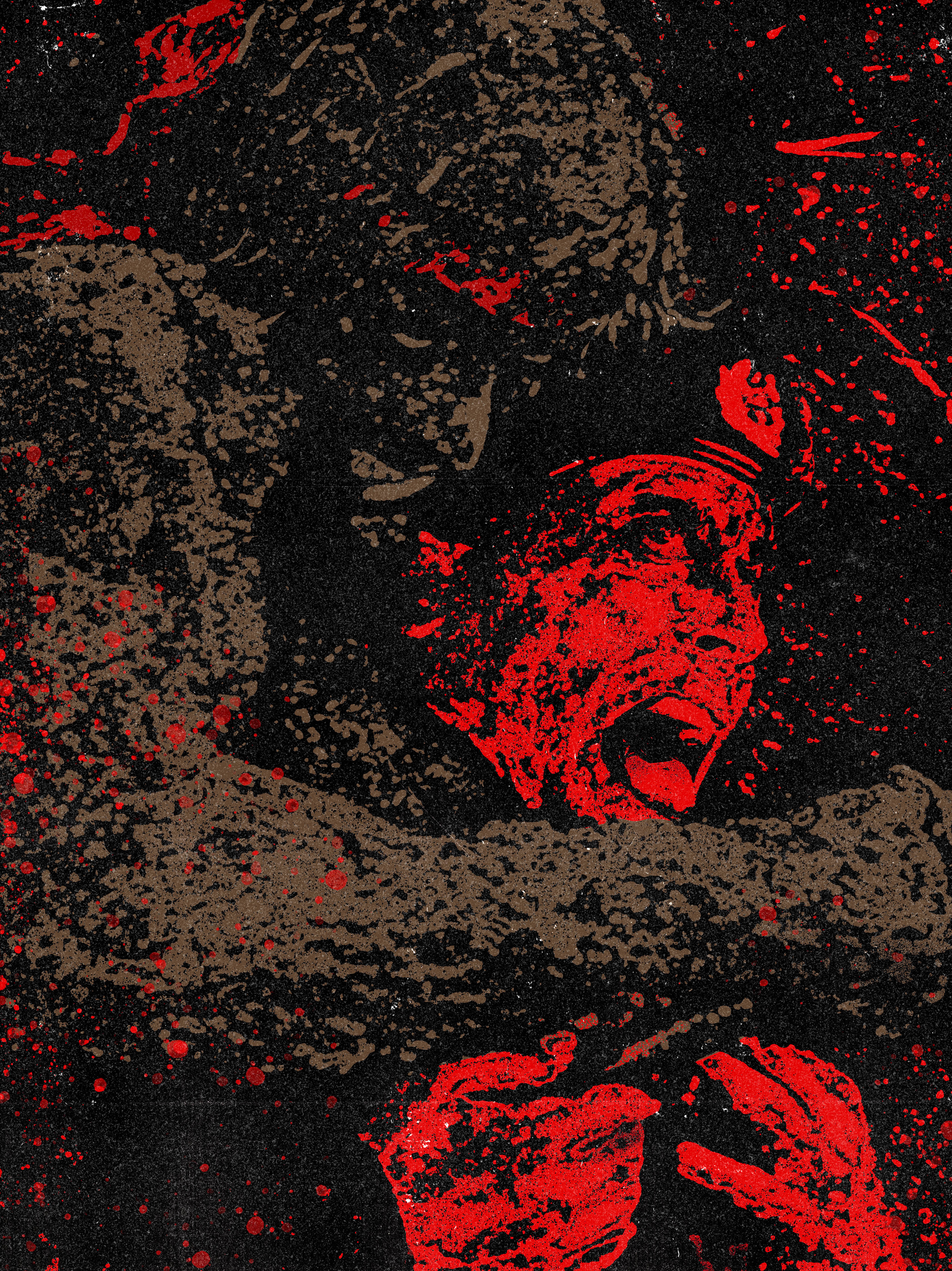
↑ No man, no law, no war can stop him. Detail of illustration for Rambo First Blood Part II, by Estevan Silveira
The Graphic Language of Estevan Silveira
Estevan Silveira is a Brazilian illustrator and graphic designer based in São Paulo. He collaborates with publishers, animation studios, and advertising agencies, often creating imaginary worlds or drawing on pop culture icons such as RoboCop, Diablo, and Evil Dead.
A defining feature of his work is a bold graphic language inspired by comics, poster art, and classical painters. His use of colour is striking, often exploring the duality of black and white or complementary hues.
Why did you choose digital illustration as your primary medium?
I chose digital media mainly because it fits the market I work in. Collaborating with publishers, studios, and agencies requires versatility, speed, and efficiency, as well as constant openness to revisions and changes in direction throughout the process. Digital tools respond very well to that pace.
My process is also strongly influenced by graphic design. There is a way of thinking, building, testing, and editing images that naturally leads me to digital. It allows me to structure ideas more clearly and explore compositions and colour with greater agility.
Traditional media is still important to me, especially in the exploratory phase. In some projects I still start on paper, and I feel there are fewer barriers and a natural connection to physical media. Over time, and because of the urgency of the professional market, I drifted away from this practice in my daily routine. It is something I want to return to more calmly, even outside commercial work, as a form of personal research and creative escape.
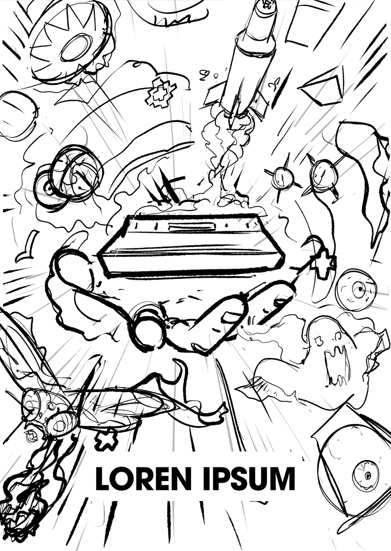
↑ Process for promotion of the re-release of the classic of classics, the unmatched Atari 2600+, by Estevan Silveira.
Who are your main sources of inspiration? I can see the influence of artists such as Mike Mignola, Frank Miller, Saul Bass, and even Rembrandt.
You are absolutely right. Mike Mignola, Frank Miller, Saul Bass, and Rembrandt are central pillars in my visual formation and remain present in my work. Each of them shaped the way I think about image, narrative, and composition.
Mignola and Miller were fundamental in the development of my graphic language, especially in the use of contrast, silhouette, and visual synthesis. Saul Bass’s direct and conceptual approach, combined with his expressive use of form and rhythm, had a strong impact on how I structure images and visual storytelling. Rembrandt is intrinsically connected to my understanding of light and shadow, volume, and atmosphere.
I also have to mention Will Eisner, for the revolutionary way he pioneered narrative in graphic novels; Caravaggio, for his dramatic use of light and shadow; Jim Steranko, for bringing graphic design and op art elements into comics; and Sergio Toppi, a master of unique graphic storytelling through form, silhouette, and the manipulation of positive and negative spaces.
These influences shape my approach to every piece, where the interplay of light, shadow, and negative space is never just aesthetic, but a deliberate tool for narrative depth.
How important is it for an illustrator to have a distinctive style? As someone capable of working in multiple styles, do you have a unifying thread across your projects, such as your approach to colour?
I believe both approaches are valid, each with its own advantages and limitations. Having a very distinctive style can make it easier to access certain types of projects, especially those that require a specific visual identity. It also helps with recognition and visual consistency. On the other hand, there is the risk of repetition, of becoming associated with only one kind of work, or facing limitations when trying to move beyond that image.
A more versatile profile, capable of working across different styles, expands possibilities and allows for greater project variety. This flexibility can be very positive, as long as the artist has a clear sense of their own voice. Without that, versatility can dilute identity and weaken consistency.
"Colour became my safe ground.
It works as a unifying thread
across projects. The way I think
about palettes, contrast,
and colour relationships
ends up connecting very
different themes and visual
languages within my portfolio.
— Estevan Silveira
I also believe success is linked to many factors, not necessarily to adopting a single style. For a long time I questioned the need to be recognized by one specific visual language, and I came to understand that style goes far beyond the final graphic result. It is much more about reasoning, creative process, and the decisions an artist makes along the way, regardless of tools or techniques.
To manage the diversity of my portfolio, I structured my areas of work into clearer niches, each with more defined visual approaches. Some fundamentals, such as contrast, form, silhouette, and colour, are consciously present in all of them, which allows me to maintain consistency even while working across different styles.
I believe this versatility comes largely from my background in graphic design. Design is inherently multidisciplinary, and every project demands a specific way of thinking. The key is maintaining high quality and an authentic voice, regardless of style or technique.
Which recent project are you most proud of, and why?
I could mention several recent projects for different reasons, such as the artwork for the RoboCop 3 vinyl release, the poster for Ryan Coogler’s film Sinners, or the launch campaign for Diablo IV. Among them, the Diablo IV project was the most meaningful to me.
Working with the Diablo franchise was both a personal achievement and a major professional challenge. My connection with the game began in 1997 with the release of the first Diablo, and I have followed the series ever since. Being part of that universe so many years later had special significance.
The project came through an invitation from Black Madre and involved creating a monumental poster inspired by The Garden of Earthly Delights by Hieronymus Bosch. The idea was for the artwork to be displayed at the Prado Museum during the game’s launch, like it was temporarily replacing the original painting. The scale and complexity required a high level of planning and collaboration.
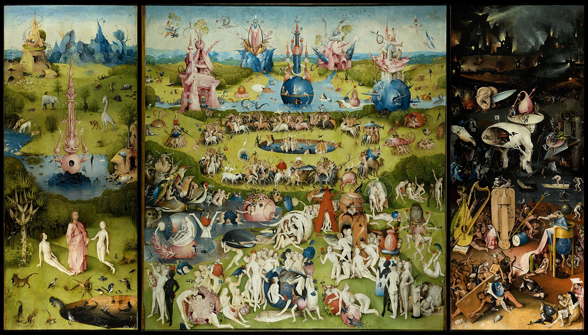
↑ Hieronymus Bosch, The Garden of Earthly Delights, oil on oak panels, 205.5 cm × 384.9 cm (81 in × 152 in), Museo del Prado, Madrid
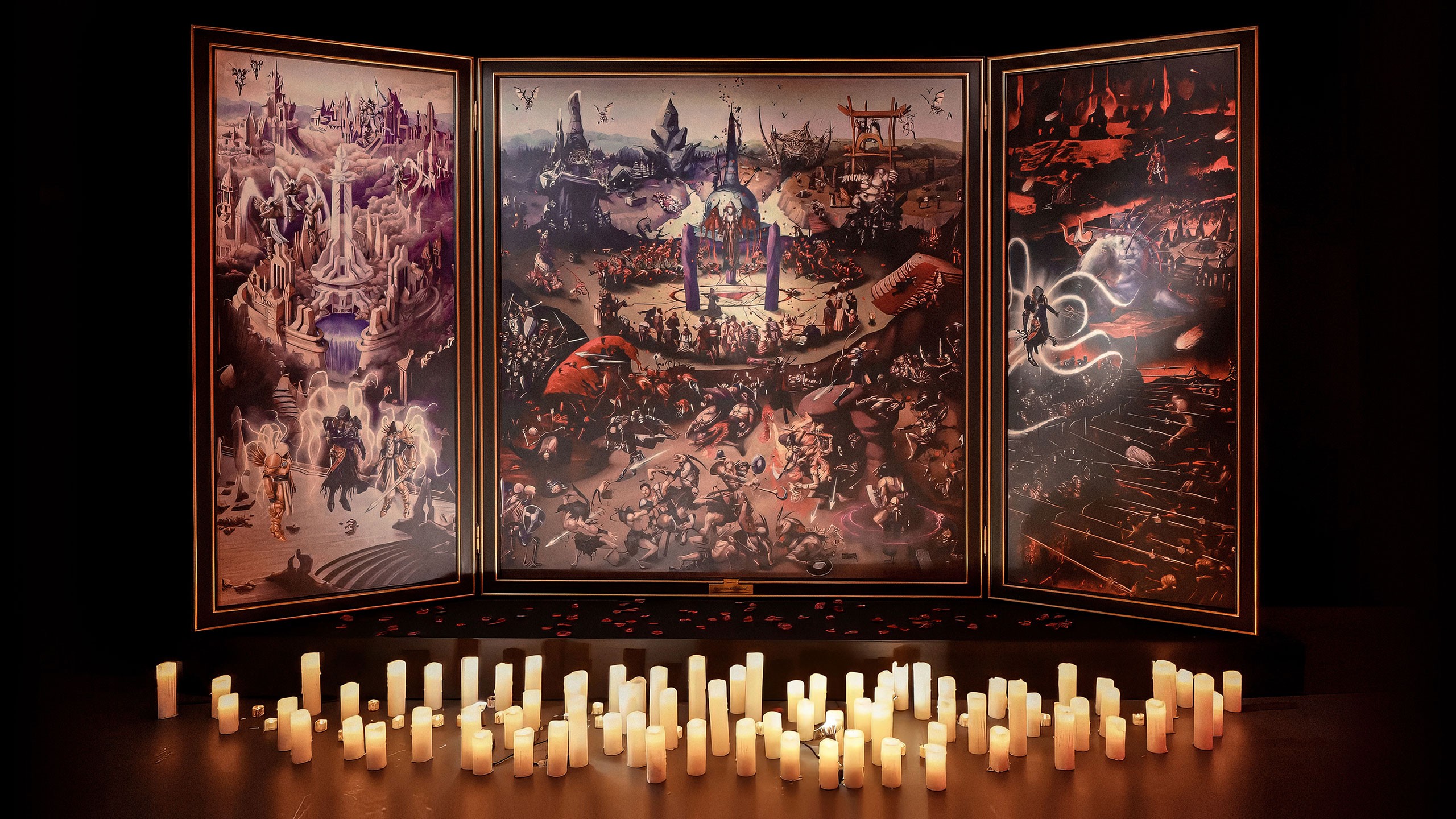
↑ The final Diablo IV Triptych
I worked alongside eight other illustrators, and we developed a structured workflow to ensure visual and narrative unity. The final piece measures roughly 220 by 390 centimetres and is organised as a triptych filled with characters, monsters, and battle scenes. Each artist was responsible for a specific quadrant, but all sections needed to work together as a whole.
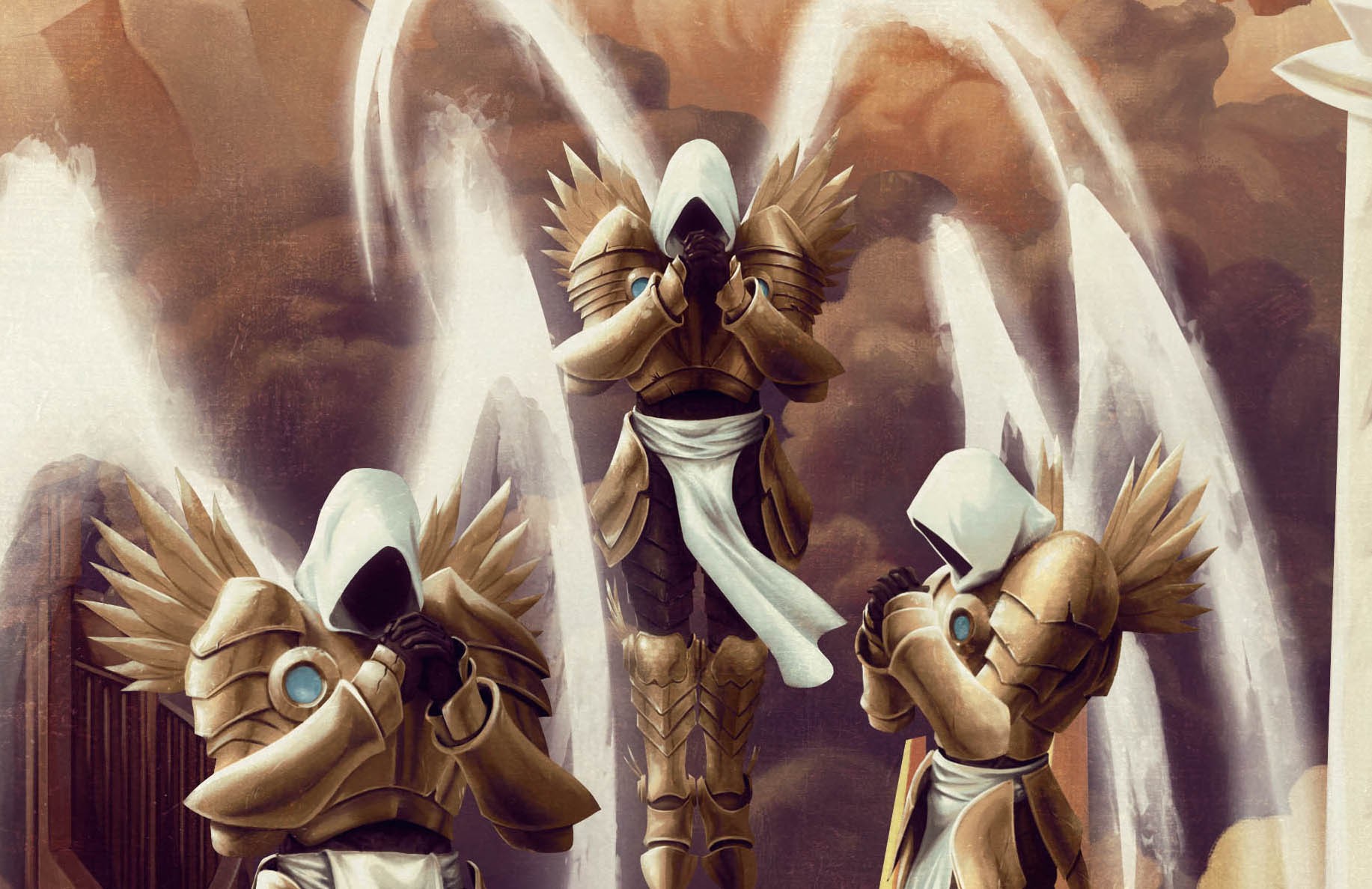
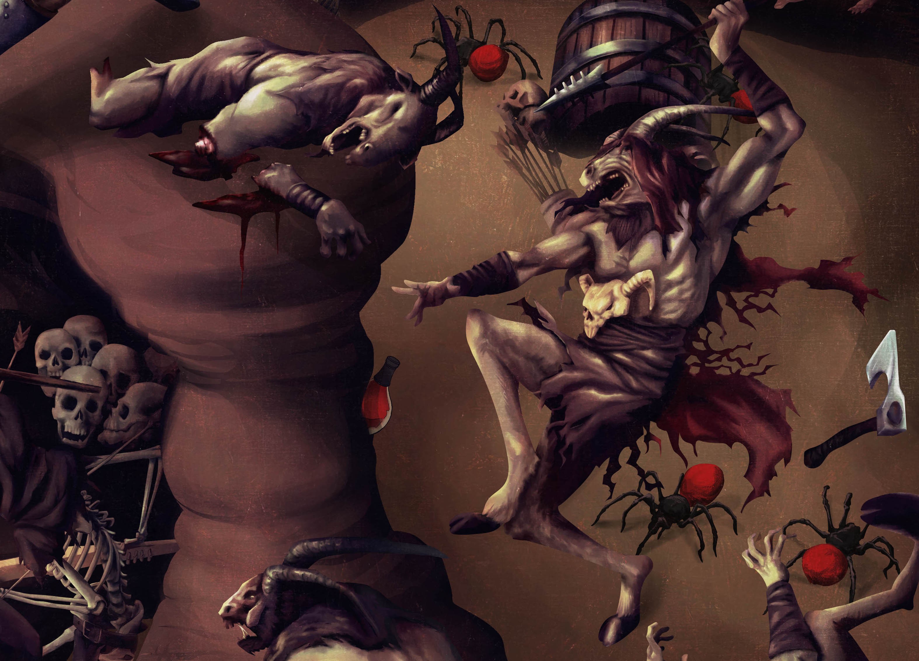
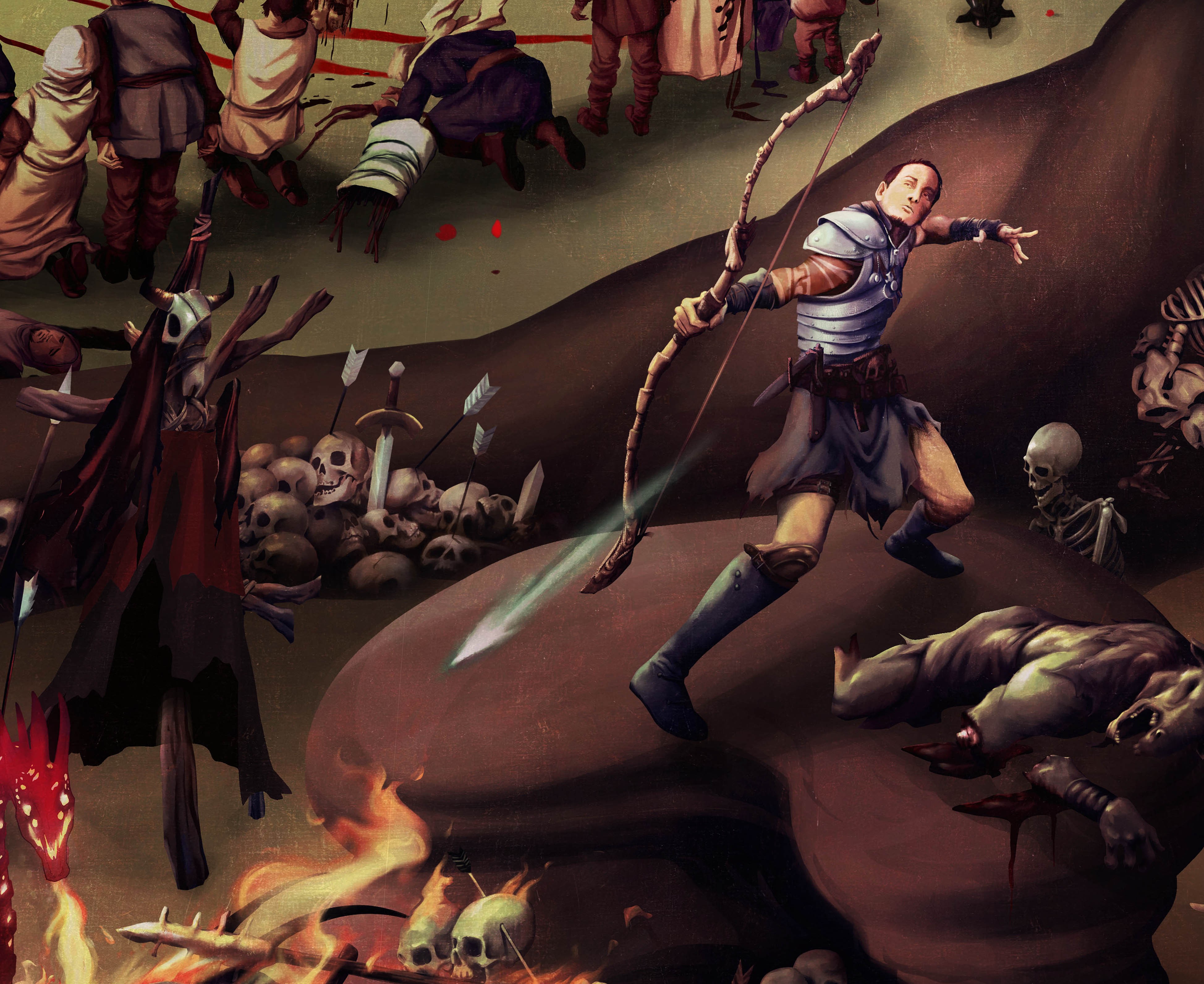
↑ Details from the Diablo IV Triptych section illustrated by Estevan
It was a demanding yet very rewarding process. The final result worked beautifully, and I am proud to have taken part in a project of that scale, both for the creative challenge and its symbolic value.
Much of your work explores duality—through complementary colours, like in the poster for Sinners, or limited palettes, such as black and red for Alien. Could you explain how you approach colour? For our readers, could you also explain the concept of complementary colours?
Much of my work is built around contrast, which has become a central element of my visual language. I am very drawn to the duality of black and white, the use of negative space, and the dramatic impact this kind of approach creates. As an illustrator and graphic designer, I see images as a form of storytelling, and contrast is a powerful tool for guiding the viewer’s eye and creating visual tension.
Complementary colours follow the same logic. They are colours positioned directly opposite each other on the colour wheel, which is why they create such strong contrast when combined. This effect appeals to me because it allows colour to function narratively, helping establish focus, rhythm, and emotion rather than serving a purely decorative role.
In practice, I often work with a dominant, calmer colour at lower saturation and introduce accents of its complementary colour to create focal points. Many times I use analogous colour schemes with a complementary accent, or split-complementary arrangements. This keeps the palette more controlled, avoids distractions, and makes the image clearer and more direct.
This level of colour control strengthens both visual impact and the clarity of the idea I want to communicate.
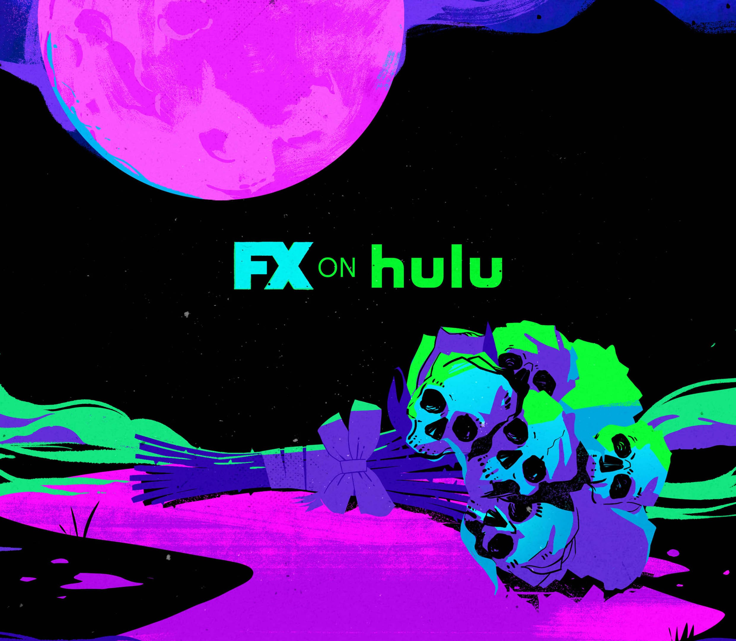
↑ Concept artwork exploring complementary colours for Hulu's What We do in the Shadows key art, by Estevan Silveira
I can see many of your projects use digital textures. Why do you employ them?
The use of texture varies greatly depending on the context of each project. In some cases, it appears very subtly, simply to break the overly clean digital look, such as a fine grain that adds a sense of organic quality without drawing attention to itself.
In other works, texture plays a more narrative role. It can help create the feeling of something aged or hand-painted, as in the Diablo project, or contribute to a more unsettling atmosphere in horror posters by introducing noise and visual wear.
There are also situations where texture does more harm than good. When overused, it can clutter the composition or interfere with readability. I always try to treat texture as a tool in service of the concept, not as an automatic effect. It always depends on the context.
By limiting your palettes, you also optimise the time spent altering designs. Can you share any behind-the-scenes insights about your collaborations with art directors?
In a way, limiting the palette becomes a strategic tool within the process. When base colours are clearly defined from the start, decisions and revisions tend to be much more objective.
In most projects, I begin with black-and-white shapes to establish composition. Colour is introduced later, in a very simple way, almost like a visual map. This helps align mood, contrast, and visual hierarchy quickly, without unnecessary distractions, and allows everyone to understand the final direction more intuitively.
Colour is always a major point
of focus in discussions.
Starting with a very
complex palette with too many
variations can easily create
visual noise and shift attention
away from narrative and
readability. More controlled
palettes keep the process
clearer and more efficient.
— Estevan Silveira
There is a great behind-the-scenes story from the RoboCop 3 vinyl project. Working with that franchise alone was already a personal achievement. I grew up with those 1980s action and sci-fi films like RoboCop, The Terminator, and Blade Runner, which were hugely influential to me.
During the process, Andy Fischer, Director of A&R at Varèse Sarabande Records, mentioned that Frank Miller had been a screenwriter on RoboCop 3 and suggested referencing Miller’s visual style in the artwork. Miller has always been one of my biggest inspirations. My early editorial illustrations for magazines like Superinteressante and Mundo Estranho were heavily influenced by his high-contrast aesthetic, especially on darker subjects.
That suggestion immediately took me back to that phase of my career. Bringing that language into such a symbolic project felt like closing a cycle in my own creative journey.
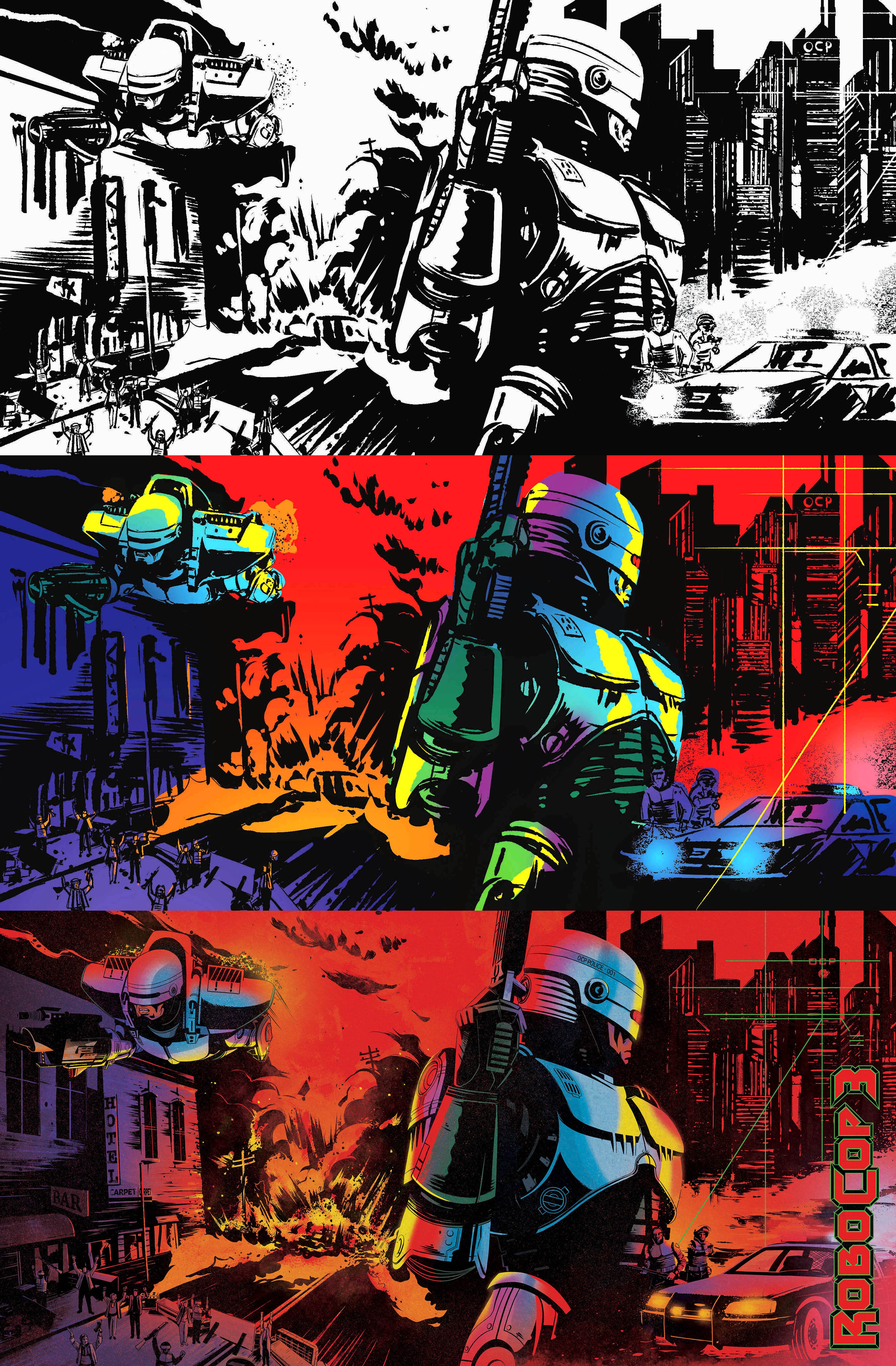
↑ Robocop 3 Vinyl project from Estevan Silveira for Varèse Sarabande Records
You’ve completed several courses and studied colour theory extensively. How much of your approach is instinctual, and how much is based on formal knowledge?
Today, I feel there is a very clear balance between instinct and formal knowledge in my process. Early in my career, everything was very conscious and study-driven. My design education and various illustration courses played a major role in how I approached colour and composition.
Over time, this knowledge became internalised. Many decisions that were once rational now happen almost intuitively, but they are the result of years of practice, observation, and study. It is an instinct that only exists because there is a solid foundation behind it. In the beginning, for example, I constantly relied on the colour wheel to build harmonies, whereas today I create palettes almost automatically as part of my visual language.
Much of my aesthetic also comes from my interest in horror, science fiction, and pop culture. The way I approach these themes is not just personal taste, but the result of extensive consumption, analysis, and trying to understand how those images function visually and emotionally.
I am naturally very observant, and almost everything I see turns into a mental exercise of visual translation: how it could become an image, a composition, a palette. Constant updating, association, and manipulation of references are essential parts of my creative process.
In the end, the more time you spend studying and practicing, the more fluid the process becomes. Instinct does not replace knowledge; it is built from it.
How does your process change when working on commercial projects? Could you pick three projects that differ from what we’ve discussed above and explain how?
In commercial projects, my process usually shifts between collaborative and individual workflows, and this significantly affects how each stage unfolds.
When working with production companies and studios, the workflow is often segmented and involves multiple artists. There are typically clear phases such as concept development, storyboarding, and final rendering. In some projects I focus only on the early concepts, in others only on execution, and in some I participate throughout the entire process. On Disney+ Hallowstream, for example, I worked from storyboards and scene concepts all the way through to final artwork.
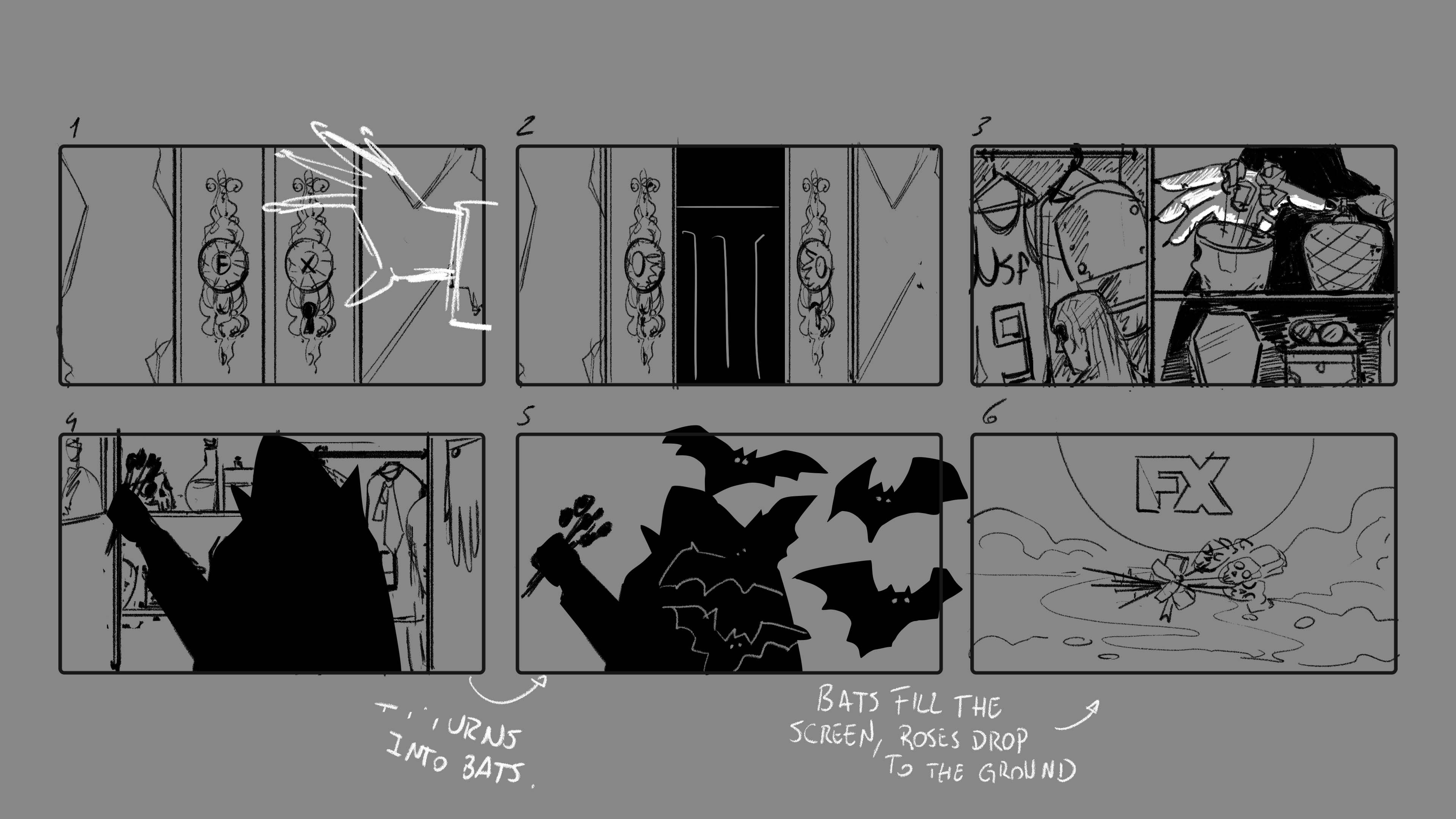
↑ Storyboards for Hulu's What We Do in The Shadows video promotions, by Estevan Silveira
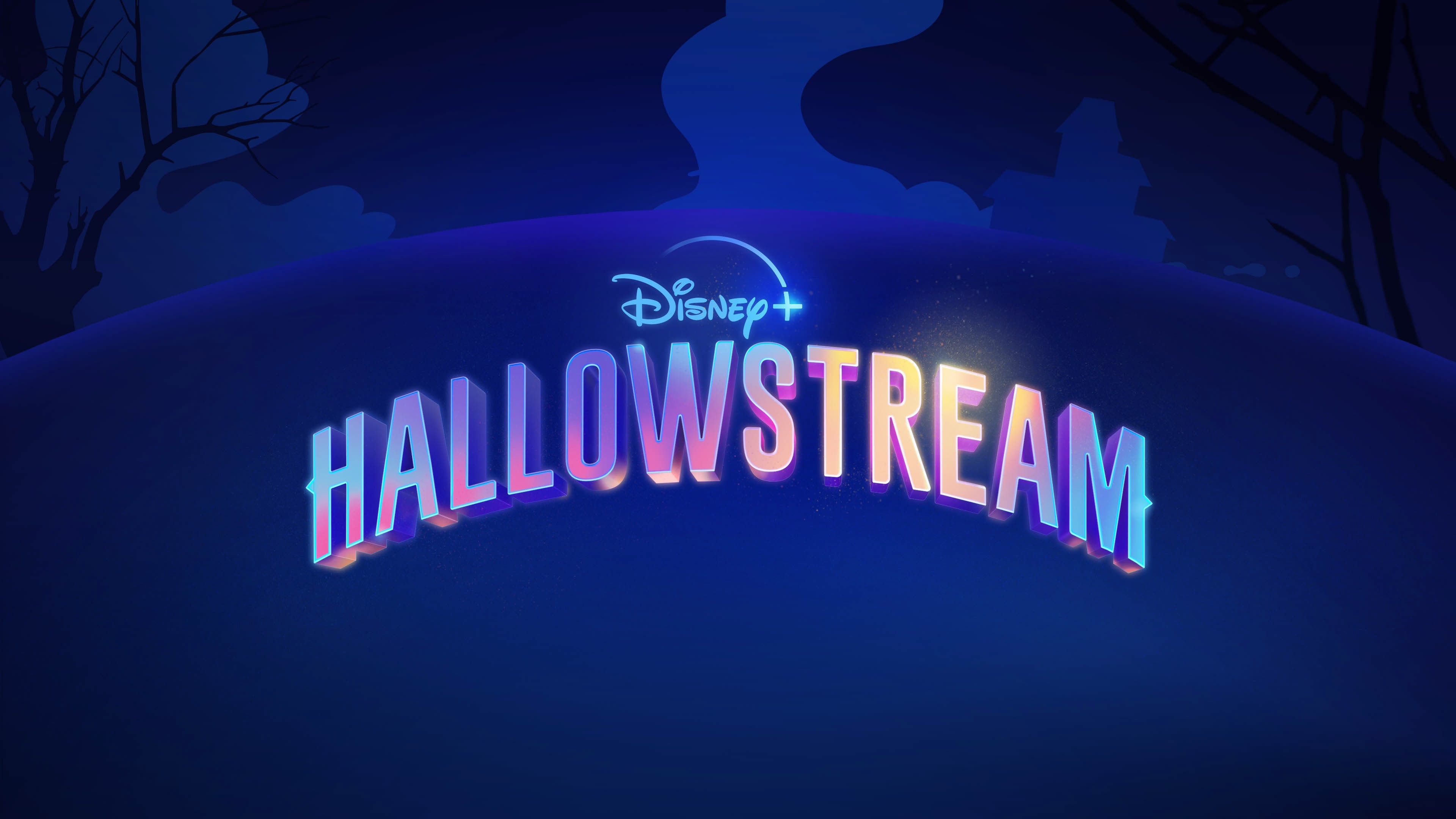
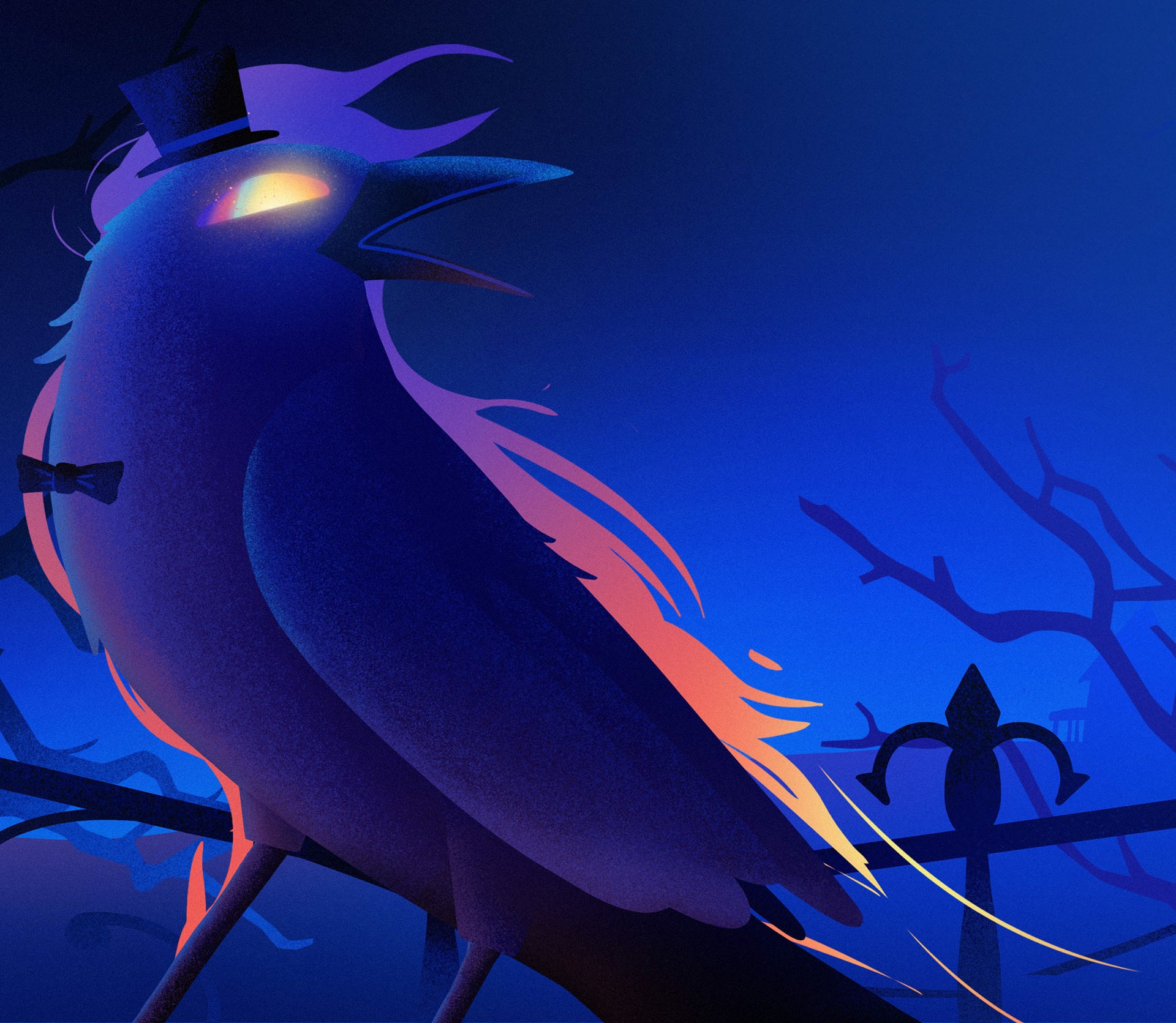
↑ Key arts for Disney's Hallowstream season, by Estevan Silveira
It is also common to work within a visual style already being developed by another team. On Wrexham Season 3, I began with poster concepts and storyboards while the campaign’s final visual language was created by my friend Helton Mattei and Dlanid Designs. Once the style was established, we developed key frames for TV commercials and animations, and my role involved adapting and creating new assets while maintaining full consistency with the campaign’s look. This kind of adaptation is very common in studio work and highlights the importance of mastering different styles and techniques.
This process is quite different from film poster projects, where we usually receive very limited information. In those cases, the work becomes one of interpretation based on elements like a synopsis, keywords, and trailer footage. For the Sinners poster, for instance, we only had access to basic material, as the producers wanted to keep major plot points secret. Creating imagery under these conditions is completely different from designing a poster after watching the full film, where understanding the story can dramatically change your initial perception.
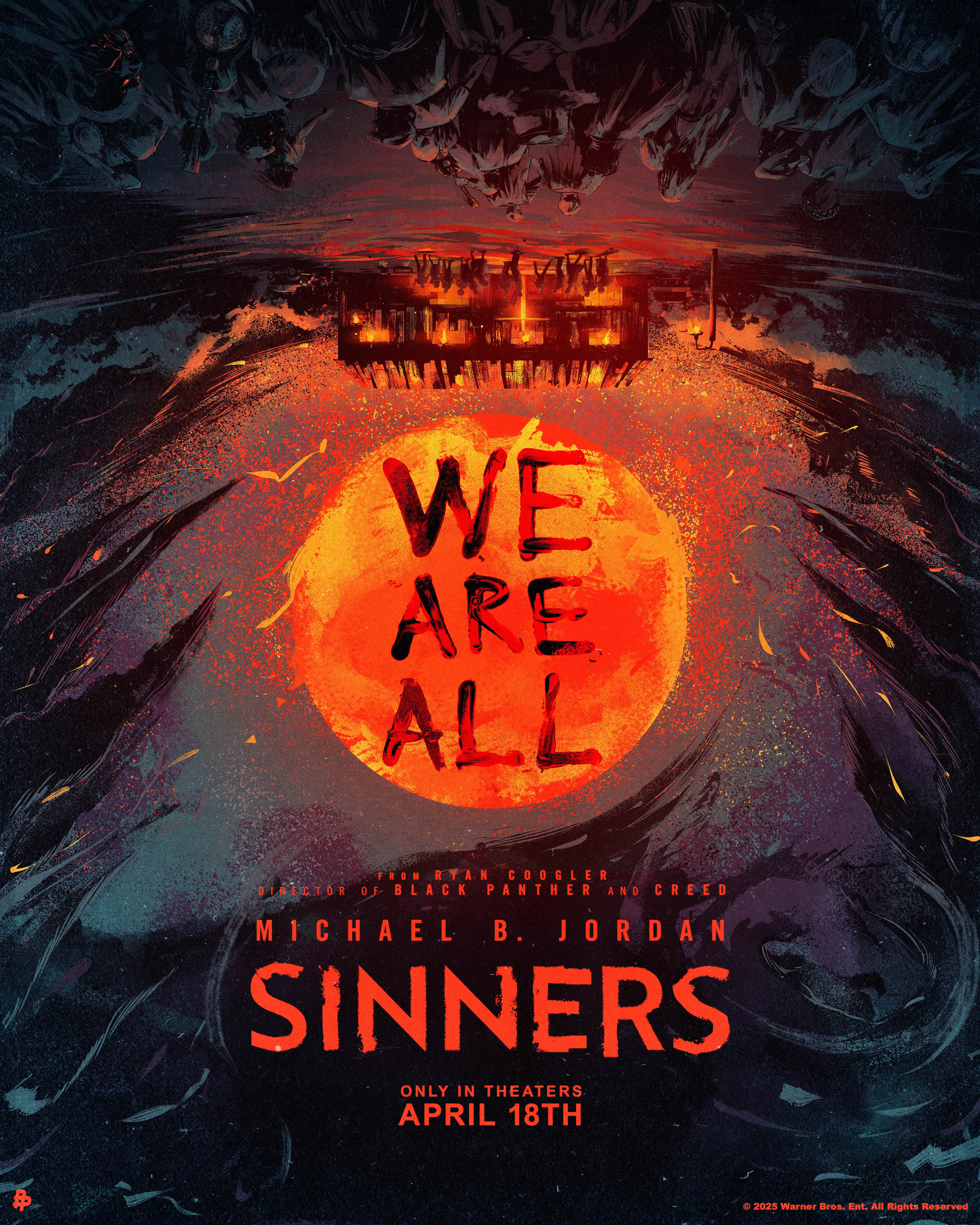
↑ For the Sinners poster, Estevan had access to basic material, as the producers wanted to keep major plot points secret.

off
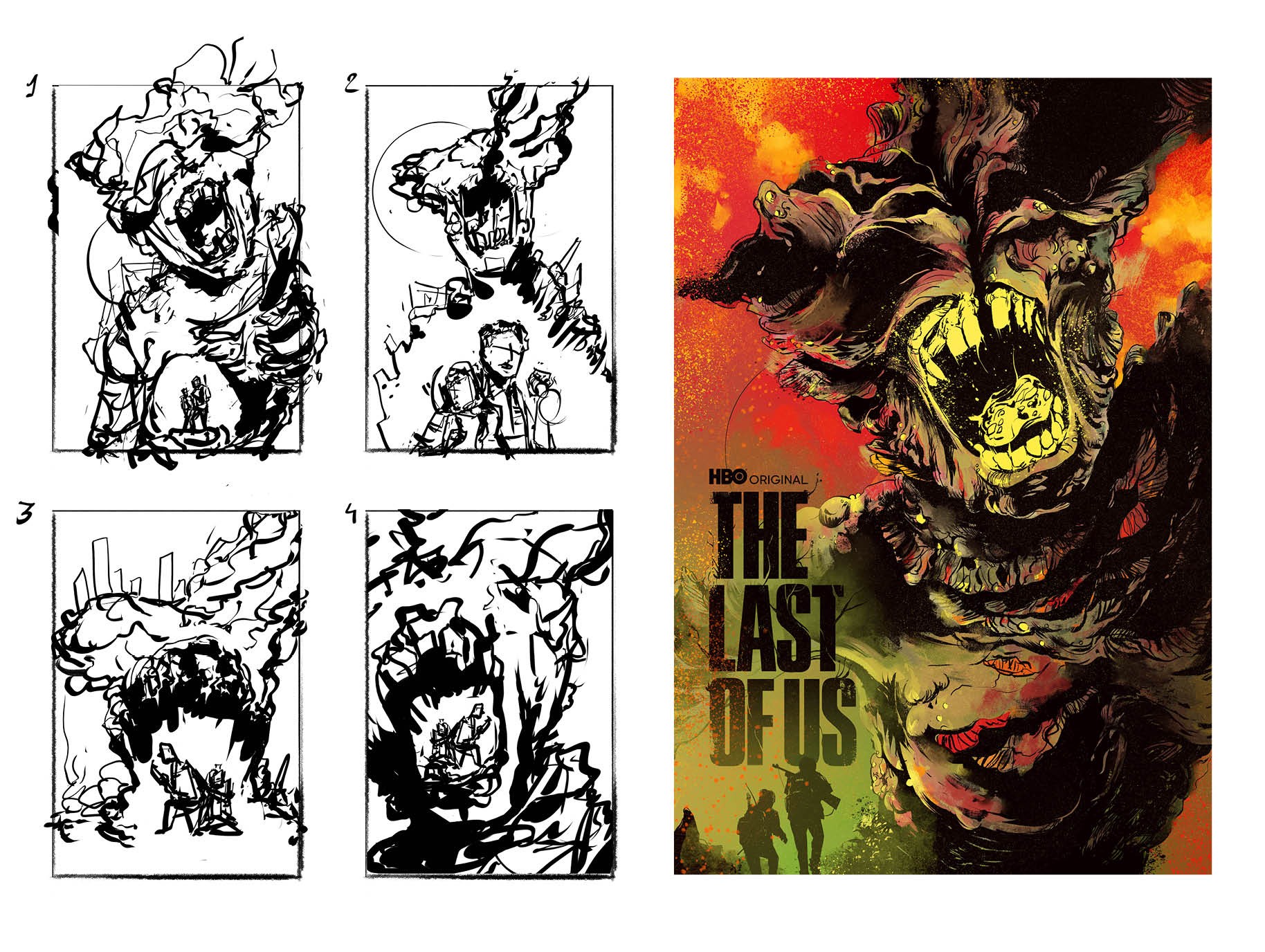
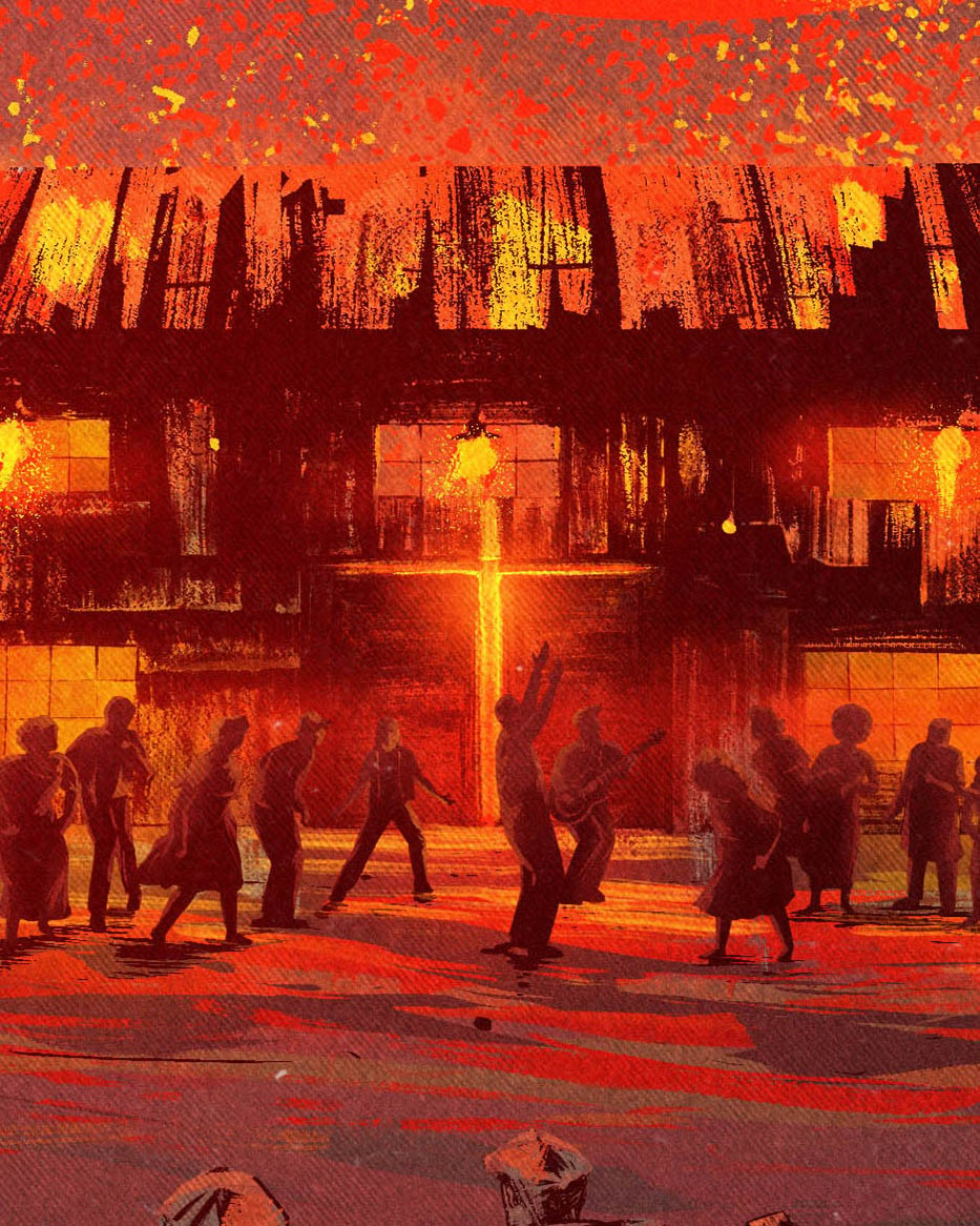
↑ From composition sketches to final poster for The Last of Us, by Estevan Silveira
Composition and colour books
When asked about book recommendations, Estevan recommended two: Color and Light by James Gurney and Framed Ink by Marcos Mateu-Mestre.
Framed Ink
"Framed Ink is not specifically about colour, but about composition and visual storytelling, which are central to my approach and directly influence how I use colour within images," Estevan says.
Framed Ink: Drawing and Composition for Visual Storytellers focuses on composition as a way to direct attention within an image. The book explains how framing, value contrast, scale, and placement establish visual hierarchy. Using black-and-white examples, Mateu-Mestre breaks down scenes into foreground, midground, and background, showing how elements are arranged and how the viewer’s eye moves across a frame. The text addresses staging, clarity, and narrative flow as structural parts of image-making. Mateu-Mestre is a visual development artist, storyboard artis known for films such as The Prince of Egypt, The Road to El Dorado, Puss in Boots, Ultraman: Rising. His work focuses on staging, composition, and continuity, and he is also the author of Framed Perspective, which examines spatial construction and perspective systems for drawing.
Colour and light
Color and Light: A Guide for the Realist Painter examines how light affects the perception of colour. Gurney outlines concepts including color temperature, reflected light, atmospheric perspective, and simultaneous contrast. The book uses diagrams and painted studies to show how illumination changes local colour and how shadow defines form. It also covers topics such as limited palettes, night scenes, and different types of light sources, focusing on observation and its role in colour decisions. Gurney is the creator of the Dinotopia series, which combines narrative and painted imagery, and he writes and lectures about colour, light, and visual perception.
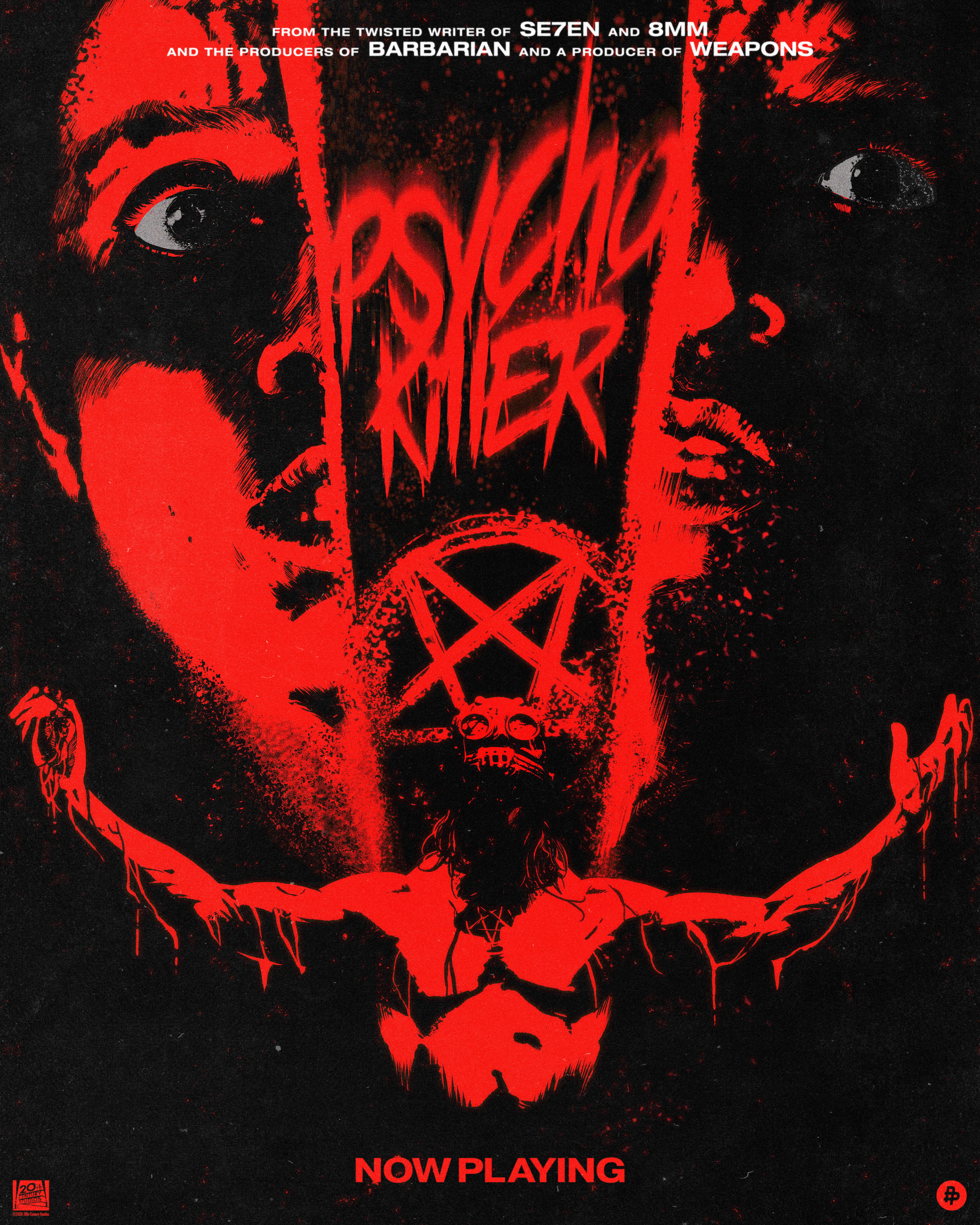
↑ For the Psycho Killer poster, Estevan uses an inverted cross as a composition device.
words
Estevan Silveira is a Brazilian illustrator and graphic designer based in São Paulo, known for bold graphic narratives shaped by contrast and colour. His favourite colour is red.